 The Official Website of Don McGregor

Stalking the Tone of Nathaniel Dusk with Tom Ziuko
Don McGregor
April 27, 2012
A writer in comics, who has a vision for that book, for what it can be, for how that world and that story should be conveyed, can’t walk away from the project once the words have been written.
Most of my closest friends in comics have been artists.
You work side by side, day after day. And it is my feeling that I have to keep everybody’s energy up, that we are doing something worthwhile, and that as exhausting as it can get, the talent involved are all as invested in what we’ve done as when we began.
The people I work closest with after that are colorists.
Artists mostly work closely with inkers.
In almost every major series I have done, I’ve had an idea on how the coloring should be approached.
The coloring for Nathaniel Dusk, for instance, is nothing like Ragamuffins. And the coloring approach for Sabre, which is really eclectic and needs many different approaches, is totally different from any of them.
I loved working with Glynis Oliver on "Panther's Rage" because I knew she understood what I needed.
I always felt a little sorry for Petra Goldberg because she had both Don McGregor and Craig Russell, who had very definite ideas on the approach to scenes, and listened patiently to us, and gave it her all, as long as she got to use the color purple.
I lobbied for printing Gene Colan’s penciles for Ragamuffins in color. I knew the approach I wanted for the sequences in the past, and the ones in the future.
But I would have no clue how to do that.
Dean Mullaney figured it.
Steve Orliff got the credit line.
It wasn’t until years later that I learned Sam Parsons had worked on Ragamuffins coloring, not until we were doingZorro: Matanzas! together, but you never got to see that version.
It goes to show that no matter how much you stay with a project there are often aspects to it you aren’t aware of at the time, and maybe never will be.
Dean had told me to have DC call him, and he would tell them how Eclipse had managed to print color with Gene Colan’s pencils.
When Nathaniel Dusk: Lovers Die at Dusk came out, I got an agitated phone call from Gene that the line-work was dropping out.
He was right.
When I asked what happened, I was told a big company did not call a small company like Eclipse.
And my response was, “So you would fuck up this book, and Gene’s art because you guys can’t make a phone call.”
When the second series was started, I talked with Tom Ziuko. You are going to see his wonderfully effective and evocative coloring below, with some of Tom’s comments.
He was displeased with what had happened with the first series.
We met together, and I told Tom what I hoped for, that the approach to Dusk should be like his name, there’s always a subtle shading even at high noon, it’s always Dusk, the color is as furtive as the character’s motives.
Tom was great, and you can see his skill.
The only request I had of Tom was, in a middle sequence, Dusk was in a green suit. I said to Tom he had that soon on that one day and should never wear it again.
I thank Tom for caring so much about his craft.
And about this comic.

Tom says:
This is a page of test coloring I did at DC – hand colored on matte stat paper with Dr. Martin dyes – in order to determine if we could print the second Nathaniel Dusk mini-series directly from Gene Colan's pencils.
Don's comments on this page:
Tom, This page alone is a delight. As was working on "Apple Peddlers Die at Noon". I love the shafts of light streaming through the overhead train tracks on lower Manhattan streets. Gene did a superb job of capturing the city and the times, and your coloring enhanced everything. The two pages you Posted on my wall are quintessential film noir in comics. I love everything about them. You can read a lot about the time period I was doing Dusk up on Comics Bulletin. You should be able to send these color pages to the page, or to them. I'm sure they would love to see them, and have their readers have a chance to do the same. I only wish there could have been a "Hookers Die at Midnight". Thanks for you time and caring.
Tom says:
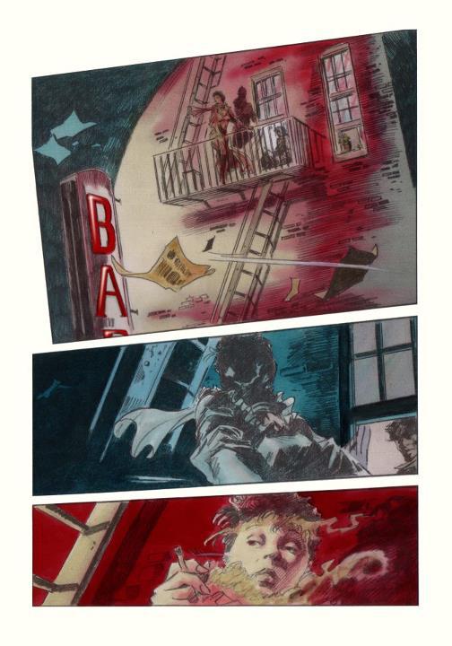
I may be partial to them since I was privileged to be a part of the creative team, but my all-time favorite Don McGregor writing remains the Nathaniel Dusk books. And perhaps my favorite two page spread from the entire run of the series – maybe of all the Gene Colan art I ever got to color during my career – are these two pages. The idea here is that the neon sign is blinking on and off – hopefully that comes across through the combination of art and color. Hand colored on matte stat paper with Dr. Martin dyes. 1 of 2.
Tom says:
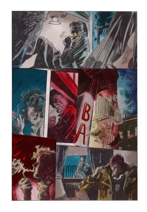
Thank you Don, for not only bringing to life one of the greatest characters in pulp fiction, but for providing me with cherished memories of both wor
king on some of the best artwork Gene Colan ever produced, and getting to meet and work with you in person. 2 of 2.
king on some of the best artwork Gene Colan ever produced, and getting to meet and work with you in person. 2 of 2.
Tom says:
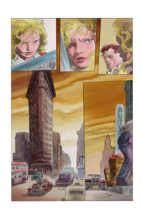
C'mon, be honest – has the Flatiron Building ever looked better than when Gene Colan drew it? I don't think it looks this good in real life… Here's another page from the second Nathaniel Dusk mini-series — hand colored on matte stat paper with Dr. Martin dyes over a screened print of Gene's pencils.
Don says:
Man, do I LOVVVVE this page. Richard Becker just informed me how to correctly do an elongated love. Thanks for understanding and listening patiently to what I wanted for this series, Tom.
Tom says:
Awww, no, the thanks go to you, Don. As I said before, one of my fondest memories was you coming over to my apartment in Brooklyn to discuss the color for these stories… it's not every writer who's as passionately involved in seeing his vision through to the degree you do… I'm just so grateful I had the opportunity to work with you and Gene – AND that we got to do the second series with full-process color, after what I felt was a disappointing go-round with the coloring on the first series. Just wish I could take a whack at recoloring both series from scratch now on the computer – man, I could make that stuff sing!
Don replies:
Oh, man, Tom, the thought of us able to do that, that really makes the night sing. And coming after the horrendous Easter night with all its violent tragedy, that's so warm. The great thing was it was all these wonderful creative people, including John Costanza on the lettering, all loving comics, all wanted to DO something in comics, that made it such a pleasure. If the chance ever came, let's get together and do it again, Tom!
Tom replies:
I'm here, Don, just looking for work. If you ever get another project that you feel I'm right for, get in touch with me – I'd jump on it in a heartbeat. We may not ever get the chance to revisit Mr. Dusk, but we can forge new paths…. and I feel I'm a much better colorist now than I was 25 years ago (has it REALLY been that long?) – I've learned so much, and now that I work on the computer, I can color rings around what I used to do. The ball's in your court, mi amigo…
To which Don replies:
I wish the ball were in my court, Tom. It is especially difficult to get to do lengthy stories, to get them to the finish line, despite the fact that this is a time supposedly of graphic novels. I don't think the new Detectives Inc.: A Fear of Perverse Photos/A Repercussion of Violent Reprisal would be in color, and maybe I should do what Marsha and Dwayne McDuffie said, "Do it just as a novel." But if Young Sabre: The Early Future Years gets done, it's perfect for color. But despite length, there's still taboo areas to get by, and I'm not interesting in standing still in terms of what can be done in comics.